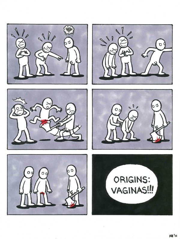
We conclude our series of Fox TV Animation art show posts with the third collaboration between me and Andrew Dowis. To start, it is a popular choice among art show participants to submit fanart of our three shows – that is, “Family Guy,” “American Dad,” and “The Cleveland Show.” The Origins art show was unique in that it forbade the submission of these works, and encouraged participants to submit works that were more personal to them. I, however, “went totally renegade on this” as “Family Guy” storyboard supervisor Dom Bianchi put it, with something that wasn’t personal, yet was faithful to the very theme of the show: Origins (duh!).
The infamous “Origins: Vaginas!” comic, while not the best in show, got the most cerebral response that day on Thursday, October 6, 2011. I was told that at times, there would be a group of women standing in front of it, wondering what to make of it. Some people would have walked right past it if their curiosity wasn’t sparked by the sight of the word vaginas clearly written in caps in the last panel. But everyone seemed to agree that the gore and violence was cringe-worthy. As “Family Guy” storyboard artist Annie Brown said, “Your comic is terrible by the way. It hurt me.”
The horror began with an AIM discussion with Andrew, where we were throwing around ideas for the Origins show. It’s a joke between him and his friend and co-worker Kenny Arehart, that the vagina looks like an ax wound. That was what he was thinking of when he came up with the following idea, in his own words, on AIM:
two asexual genderless naked people are making fun of Tom’s “weird dangly thing,” laughing and pointing at his penis
he gets frustrated, takes out an axe, and chops one of the genderless bullies in the crotch
last frame is the three of them pondering the wound
origins: VAGINAS!
It was shocking, it was brilliant! But I wasn’t comfortable with drawing any of it, mostly because I imagined the finished comic with more realistic-looking people in it; it felt way too pornographic for the show. But when Andrew told me that he imagined them being stick figures, the idea didn’t seem as terrible anymore.
The comic started out like how most industry folks did storyboards in the days before Photoshop and Toon Boom Storyboard Pro: on post-its. When that was done, I cleaned the drawings up on another set of post-its, then transferred them to their respective panels on a 9″ X 12″ Bristol board via the tracing paper transfer technique – except with post-its, not tracing paper. Color and ink was then applied with a combination of Prismacolor and Blick Studio markers. I was uncomfortably high by the end of the latter process.
