
Today is the Summer Superhero Art Show here at Fox TV Animation. As usual, I’m a participant. Aside from that, though, there are a lot of amazing pieces in this one. For the first time, I’m actually bidding for a few, one of them being a “Watchmen”/”Family Guy” piece by Mick Cassidy that I probably won’t get because I suspect the bidding competition for it will be fierce.
My submission features Torunn from “Next Avengers: Heroes of Tomorrow,” a straight-to-DVD movie that I freelanced on back in ’07. It was originally done as practice for the show on Tegaki E. But as I found myself still working on it after a few weeks had passed, I figured that it would make a great submission for the show. When the tegaki was finished, a backwards look at a test print revealed errors that I was not aware of while I was working on it. As a result, Photoshop was used to fix these errors.
There are four different versions of this work, the original being the flawed tegaki that I’m too ashamed to post here. But if you must look, you can find it here. Of the three Photoshop passes, this first one is my favorite:
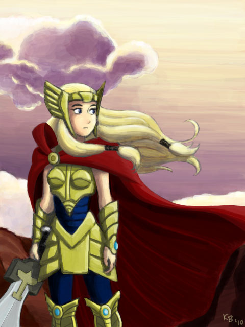
What I love most about it are the purple hues of the sky and clouds, which isn’t as apparent in the final pass. Yet I chose to submit the latter because of a second opinion from my co-worker Dante, who pointed out that it had better contrast, and I feel that it’s a more accurate depiction of sunset. Or maybe twilight? Not too sure.
Truth be told, I like the deeper saturation in the first one a little more. True that more subdued emulates realistic a little closer, but art – esp. character stuff – is a nice way to cut loose and to exaggerate elements, colors included. For me, vibrant or saturated colors help me to create the sense of a fantasy-based environment. Reality on crack, basically.
Even with the contrast in light/shadow you have here, you get a nice sense of soft diffused to the lighting and atmosphere. And without filters too, which is hard to do.
More posts, more posts.
Nothing groundbreaking to say except… I LOVE IT! I can feel the breeze. Great composition and although her expression is subdued, she definitely has a presence about her.
Nice job all around!
Thanks everyone!
Kyle: It means a lot that you like the first pass better. If anything, I should probably have more faith in my work, or what I can do without filters. I remember one of the things my high school art teacher said to me was that I was always playing it safe, and that she wanted to see me cut loose with my work. I should really remind myself to do that every time I start a new drawing.
Matt: Yes, I'll have more posts soon. I've been trying to post this thing on DA, too, but it's difficult when I don't have the time, and also because the site's blocked at my work.
Tony: You are too kind ^_^
Seeing as this post was made in July, I'm thinking the comments to prod you into posting again is about to get the green light. Still waiting for the official ok from K to do so.
Pingback: Tegaki illustrations from 2010 and something extra from 2011 | Kristina Bustamante